I feel old, really old whilst writing this post. I still can’t believe that it was twenty years ago when I was first introduced to Mac OS X (macOS now) at my dad’s office. It was a fortnight after the Holi festival and the weekend before our schools summer holidays began. Like most weekends, I had accompanied my dad to his office (a publishing house) a tech haven for me where I was introduced to the latest technology. A sunny Saturday, March 24, 2001, was the day when the computer engineers (folks who used to come and install OS, update, fix computers) were there in the office. Back in the day, OS updates were paid and not as simple as a click of a button. These computer engineers had a plethora of CDs for all the OS installation and software. Apart from the cost of the software, they would charge an additional amount for their services and time to install software or OS Upgrade.
I don’t have a photo of it but I faintly remember we had multiple Power Mac G4 serving the designing, editing and publishing duties. Also, I don’t remember the software that was used back then but I remember working on the QuarkXPress a few years later for my college newspaper design. Now before this post turns into a nostalgic memoir of my beginnings as a tech enthusiast and a publisher at heart lets get back to the evolution of macOS as we know it today.

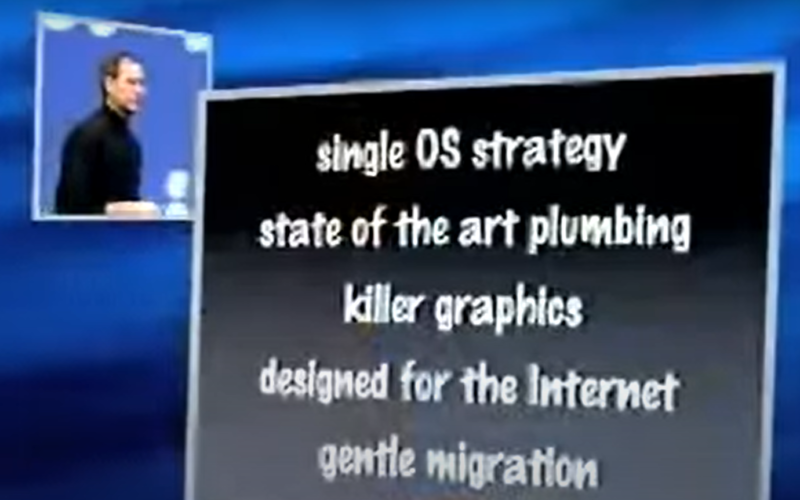
It all started with the late Steve Jobs demonstrating Mac OS X to an audience of over 4,000 people during his Macworld Expo keynote on January 5 2000. And what a day it was for Operating Systems – striking new visual appearance (‘Aqua’ UI interface), a list of new-age features that are still prevalent till date on the macOS – Dock; completely new Finder; 2D, 3D and multimedia graphics; luminous and semi-transparent elements such as buttons, scroll bars and windows, and features fluid animation to enhance the user’s experience. A benchmark that took years (read decades) for the competition to the matchup. And by the time the did manage to catch up the modern-day macOS is again leaps and bounds ahead with features like SideCar, AirDrop, to name a few.
So let’s visit the Mac OS X (macOS) versions and the software they ran over the last 20 years:
| Operating system | Safari | QuickTime | iTunes | Messages/iChat | iWork | |
|---|---|---|---|---|---|---|
| 11 “Big Sur” (2020) | 14.0.2 | 14.0 | 10.5 | N/A | 14.0 | 2020 |
| 10.15 “Catalina” (2019) | 13.0 | N/A | 13.0 | |||
| 10.14 “Mojave” (2018) | 12.0 | 12.9.5 | 12.0 | |||
| 10.13 “High Sierra” (2017) | 13.1.2 | 11.0 | 10.4 | 12.8.2 | 11.0 | 2019 |
| 10.12 “Sierra” (2016) | 12.1.2 | 10.0 | 2018 | |||
| 10.11 “El Capitan” (2015) | 11.1.2 | 9.3 | 9.2 | 2014 | ||
| 10.10 “Yosemite” (2014) | 10.1.2 | 8.0 | ||||
| 10.9 “Mavericks” (2013) | 9.1.3 | 7.3 | 10.3 | 12.6.2 | 2013 | |
| 10.8 “Mountain Lion” (2012) | 6.2.8 | Unknown | 10.2 | 12.4.3 | ’09 | |
| 10.7 “Lion” (2011) | 6.1.6 | 10.1 | 12.2.2 | 8.0b or 6.0.1 | ||
| 10.6 “Snow Leopard” (2009) | 5.1.10 | 4.5 | 11.4 | 5.0 | ||
| 10.5 “Leopard” (2007) | 5.0.6 | 3.6 | 7.7 | 10.6.3 | 4.0 | |
| 10.4 “Tiger” (2005) | 4.1.3 | 2.1.3 | 7.6.4 | 9.2.1 | 3.0 | |
| 10.3 “Panther” (2003) | 1.3.2 | 1.x | 7.5 | 7.7.1 | 2.1 | ’05 |
| 10.2 “Jaguar” (2002) | 1.0.3 | 6.5.3 | 6.0.5 | 2.0 | Keynote | |
| 10.1 “Puma” (2001) | N/A | 6.3.1 | 4.7.1 | N/A | N/A | |
| 10.0 “Cheetah” (2001) | 5.0 | 2.0.4 |
macOS Big Sur refreshed the design of the user interface, rightly described by Apple as the biggest change since the introduction of Mac OS X. Its changes include translucency in various places and a new colour palette. All standard apps, as well as the Dock and the Menu Bar, are redesigned and streamlined, and their icons now have rounded-square shapes like iOS and iPadOS apps. Compared to iOS, Big Sur’s icons include more shading and highlights to give a three-dimensional appearance. Its aesthetic has been described as “neumorphism”, a portmanteau of new and skeuomorphism. System sounds are redone as well.
The new OS also brings further integration with Apple’s SF Symbols, enabling easier use by third-party developers as UI elements for their applications through AppKit, SwiftUI, and Catalyst, which makes it possible to unify third-party applications with the existing Apple-made design language.
The Interface overhaul included:
Control Center
An interface with quick toggles for Wi-Fi, Bluetooth, screen brightness and system volume has been added to the menu bar.[14] This interface is functionally and visually similar to Control Center on iOS and iPadOS.
Notification Center
The Notification Center is redesigned, featuring interactive notifications and a transparent user interface. Notification Center also features a new widget system similar to that in iOS 14, displaying more information with more customization than previously available.[8]
System
Support for Apple silicon
macOS Big Sur is the first release of macOS for Macs powered by Apple-designed ARM64-based processors, a key part of the transition from Intel x86-64-based processors. The chip mentioned in demo videos, and used in the Developer Transition Kit, is the A12Z Bionic. On November 10, 2020, Apple announced the first Mac Apple silicon chip, the Apple M1, in the Late 2020 Mac Mini, MacBook Air, and MacBook Pro. Apple has said that it will support Intel Macs “for years to come”, and most software that has not been ported to run on ARM Macs can use Rosetta 2, an update of a compatibility mechanism developed for the PowerPC-to-Intel x86 transition.
Support for iOS and iPadOS applications
On Macs based on Apple silicon, macOS Big Sur can run iOS and iPadOS applications natively and without any modifications needed from developers. The first Macs with this capability are those that use the Apple M1 SoC.
So do let us know your experience with the macOS in the comments section below or tweet to us @theunbiasedblog/@nikhilchawla.


