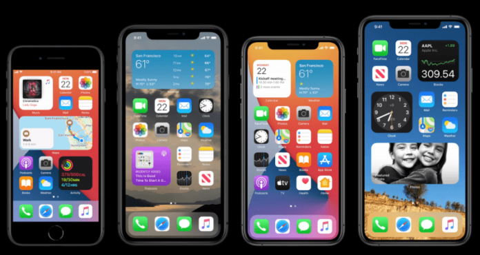
When the rumour mill went into overdrive mode before WWDC, the grapevine was that iOS 14 would be a mild upgrade with most of the attention being reserved for Apple’s big announcement for macOS and the transition to its own silicon. But boy, everyone was wrong. iOS 14 brings about a dramatic change to the core iPhone user interface perhaps more so than the shift to the full-screen bezel-less format brought about in 2017 with the iPhone X. I’ve been using iOS 14 for more than two weeks, so here are some salient improvements.
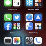
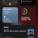
- It goes without saying that the look and feel of the core iPhone experience have changed. This is no small change, it is a massive one. You get widgets now on the home screen, and these widgets are more elegant than the ones on Android. They come in fixed sizes that the operating system postulates and generally, these make the home screen springboard more glanceable than what it used to be. Widgets also add widget stacks which make it easy to flip between widgets. So far, my favourite widget has been the Apple Music widget.
- Adding to the home screen widgets, Apple has also added a new screen called app library that attempts to declutter the home screen. This is especially handy for long-time iPhone users who may have accumulated a vast collection of applications that take up pages and pages of space. The iPhone home-screen for me had become an infinite scroll. Using the app library, I am able to delete pages of apps that I don’t use that often and find everything else in an automated stack of folders that have been created using AI. Mostly I’ve found the AI to work accurately. In this case, that’s not enough; one can also swipe down to enable a list view of all apps which will appear alphabetically. This is also very convenient.
- Apple has doubled down on privacy with iOS 14. Whenever there is text or information read from the clipboard, the operating system gives a notification that text has been pasted from an app. This is very handy. In fact, TikTok got exposed because of this ingenious feature. It 100% exposes apps that are potentially spying on you. Apple has also doubled on privacy on even Safari. Now it exposes all the trackers on the mobile browser and also helps you block them out. In fact, Apple is also exposing all apps that are accessing your photo library — by this, you can limit access to certain apps.Also Read: Apple iPhone SE Review
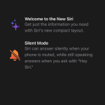
- iOS 14 also cleans up the user interface by introducing a compact UI. Compact UI ensures that certain contextual functions don’t take over the full length and breadth of the screen. For instance, it is easier to ignore calls on an iPhone because the incoming call will not take over the full UI of the phone. Similarly, Siri also doesn’t take over the full real estate of the display. Apple has also introduced an elegant picture-in-picture mode which keeps the video running till in a small movable window, till manually it has been disabled. The iPhone never made judicious use of the real estate it had on tap — that’s now changed. On the iPad as well, perhaps the biggest change is the addition of a new search bar which takes advantage of compact UI. It also now works more like spotlight search on macOS. This makes the search experience more useful.
- The Apple Pencil now works on a system level for iPads. Apple’s addition of a new feature called scribble transforms the Apple Pencil especially for more normal users who want to sign documents, annotate text — basically it has taken the Apple Pencil beyond just the use of creatives. For instance, if there is a text field, now the Pencil can be used to just enter text on the fly and automatically, the operating system understands your handwriting and turns it into text. This is by far the biggest feature for iPad OS 14, which is the version of iOS that runs on iPads.
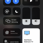
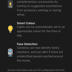
Apart from this, there are tons of hidden gems waiting to be unearthed. Siri is smarter and faster which makes it more usable, though it is still light years behind the Google Assistant. The new translate app uses Siri to do real-time transcription almost like Google Translate. It is a neat trick but there is no Indian language support right now. There is a new home centre which allows you to control your smart home gadgets on a more granular level. Apple Maps has been upgraded hugely — though for us in India, updates are rather minor.
So do let us know if you are excited about these changes coming to iOS. Share your views in the comments section below or tweet to us @theunbiasedblog
