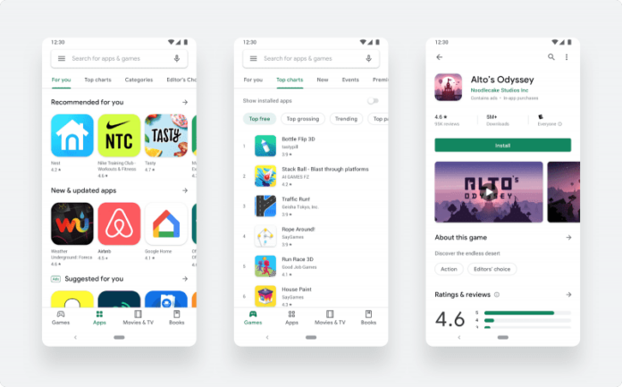
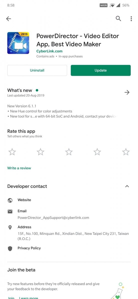
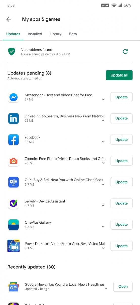
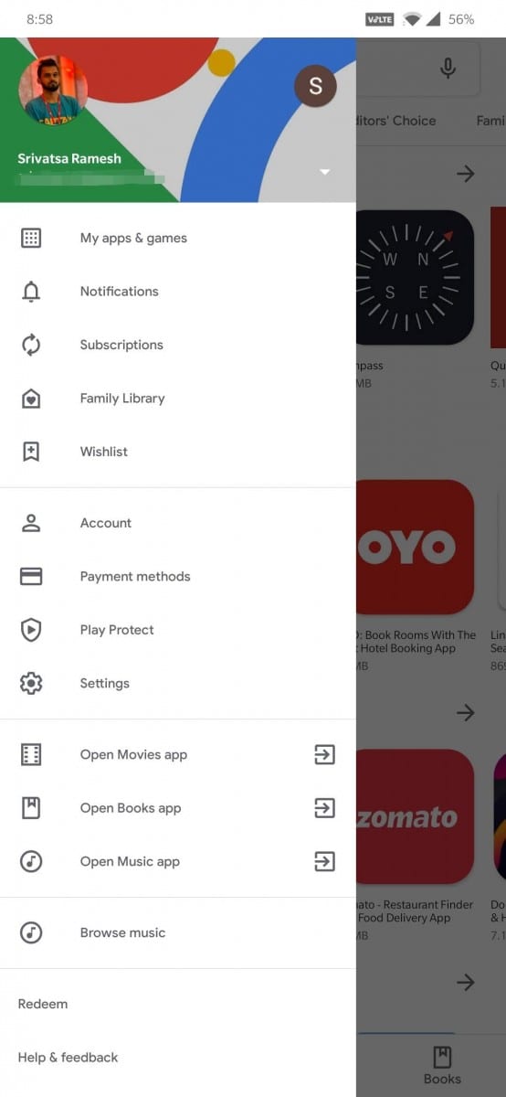
Google is now rolling out the new Material design layout for all the users on Android. The fresh Google Play redesign was under testing for the 3-4 past few weeks at least and is now finally rolling out for a wider audience globally. The Google Play Store has over two billion monthly active users coming to find the right app, game, and other digital content. To improve the overall store experience, Google’s is rolling out a complete visual redesign. Aligning with Material design language, the new look is having a cleaner, more premium store that improves app discovery and accessibility for our diverse set of users. Also, the Play Store looks whiter than it used to be(Greener).
Talking about the latest design, Boris Valusek, Design Lead, Google Play said, to make browsing faster and easier, we’ve introduced a new navigation bar at the bottom of the Play Store on mobile devices and new left navigation on tablets and Chrome OS. There are now two distinct destinations for games and apps, which helps us better serve users the right kind of content. Once users find the right app or game, the updated store listing page layout surfaces richer app information at the top of each page as well as a more prominent call-to-action button. This makes it easier for users to see important details and make a decision to install your app. You’ll also notice our new icon system with a uniform shape, helping content to stand out more over UI.
However, there are no Dark Mode options yet and we expect Google to bring it along with the Android Q in the coming days.
Here are the highlights of the new Play Store Redesign:
- New Bottom Navigation Bar on Smartphones
- New Left Navigation on Tablets and ChromeOS
- Apps and Games Section
- Rich Store Listing Page
- Uniform Icon System
- No Segmentation Between Apps List
- White Bright Look
- Slightly Rounded Corner Update, Indtall, and Uninstall Button
Follow us on Twitter for more news and updates.
Source
