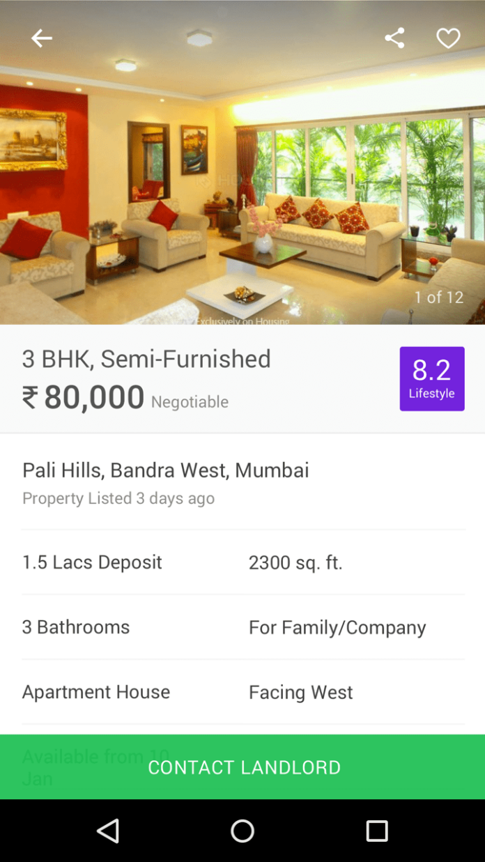
Housing today unveiled its new and refreshing brand identity. Housing is introducing a new logo along with a revamped website and technologically superior mobile application. It will enhance consumer experience and will set a new benchmark for the online real estate market.

Commenting on the launch of the new brand identity, Rahul Yadav, CEO & Co-founder of Housing said,“Our aim and belief is to innovate and use technology to make things simpler, quicker and clearer. We don’t stop at success, we strive to improve, explore and ask ourselves ‘what next?’ so we can set new benchmarks, change the game and make every customer experience 10X. In short, we Out See, Out Think and Out Do for our customers so that they can look up to us and to a better life. Our new identity is a reflection of this belief system. Life is better when you Look Up.”Summed up in two words ‘Look Up’, Housing’s new futuristic logo looks like an upward arrow, with sharp outer edges that direct towards the future, while the softer edges symbolize a nurturing shelter. The ‘Look Up’ symbol is elegantly embedded into the letter ‘H’ of the Housing logotype. These shared characteristics successfully unite to form the brandmark.
Housing came at a time when consumer was dealing with too many challenges while buying or renting a house. It was with the objective of helping consumers overcome these hurdles, that Housing created a revolutionary map-based platform with 100% verified listings and real photos. The company’s vision is to help the world to live with ambition and aspiration for a better life by changing everything to do with real estate.
According to Pratik Seal, CMO, Housing, “When a consumer decides to buy, sell, rent or invest; facts, figures, product and logic play an important part. But the real story is an emotional one. Finding a home not just impact consumer’s life but also lives of those around him; this isn’t boring stuff, this is the stuff of life. Housing wants to make its consumer’s journey a memorable, enjoyable and an unforgettable experience. ‘Look up’ is the essence of our optimistic Vision.”
In its new avatar, Housing’s new vibrant colour palette in the new logo and wordmark is based on four key brand colours that make life look brighter and embody the spirit of optimism. Christened as Housing Pink, Yellow, Purple and Green, the new brand colours play a key role in the new identity, personifying Housing as optimistic, game-changing and uncompromising.
To launch Housing’s new brand identity, the company partnered with Moving Brands, a global creative company – considered to be among the best independent creative outfits working with the world’s best brands. Over the last 12 months, their London studio worked tirelessly with the Housing team to ideate and develop the new brand identity that reflects Housing’s global vision.


